
Minimalist Ecommerce Website Examples
Explore 7 minimalist ecommerce design examples
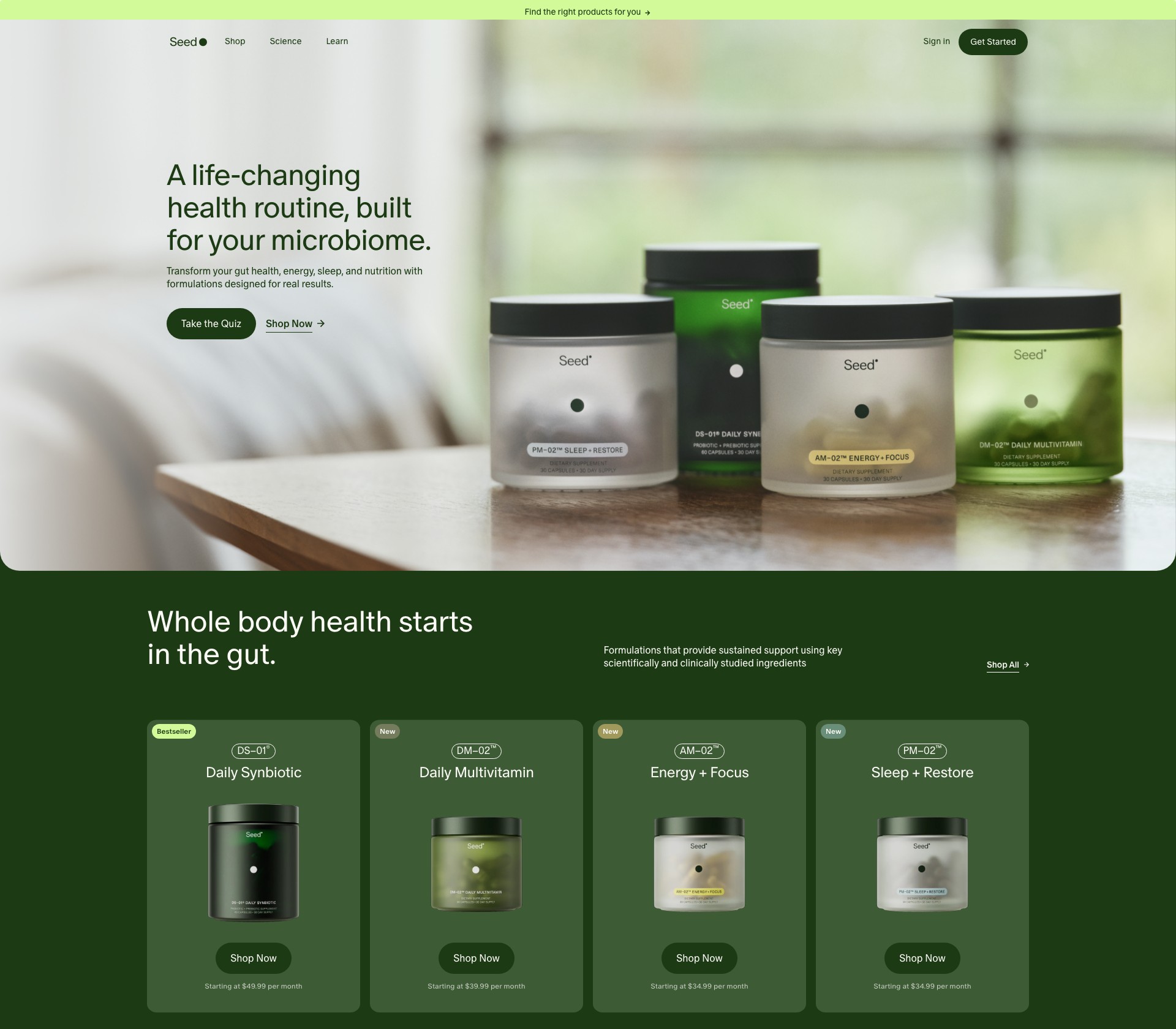
Minimalist ecommerce design strips away noise so products and brand voice stand on their own. This collection features Shopify stores that use restrained colour palettes, generous whitespace, and typographic hierarchy to create calm, confident shopping experiences. You will see how successful brands limit UI chrome, use photography as the primary design element, and structure navigation so shoppers reach products in few clicks. These examples are especially useful for teams who want premium positioning without ornamental clutter—where every element on the page must earn its place.
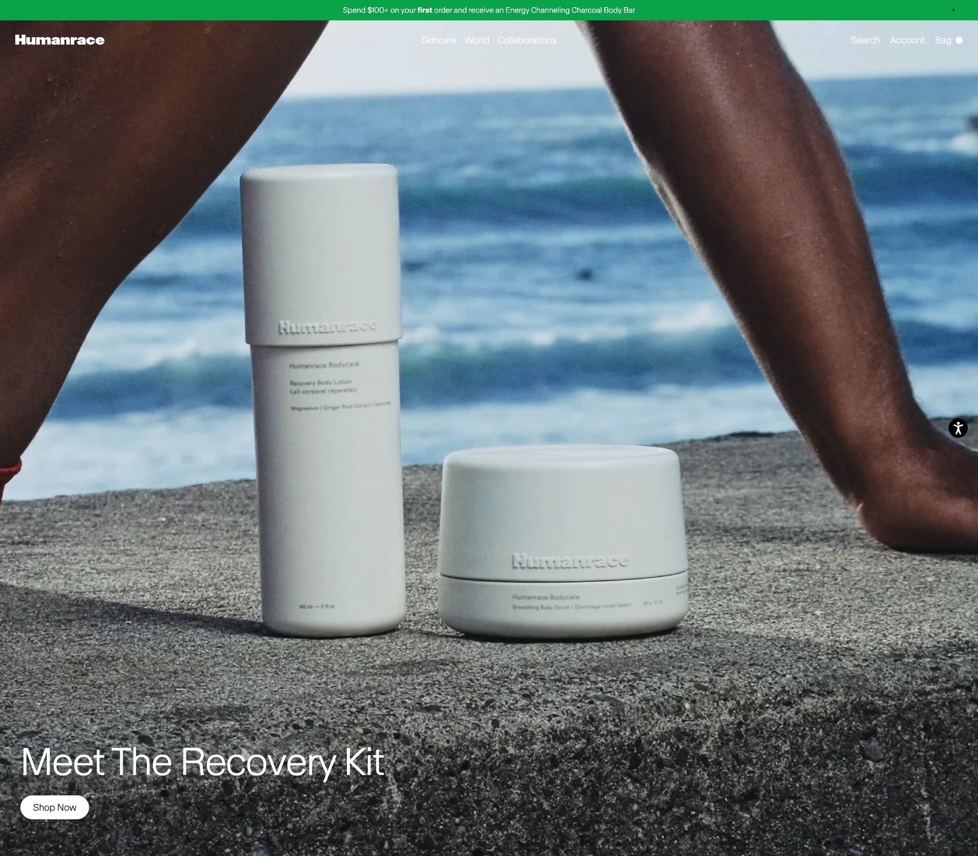


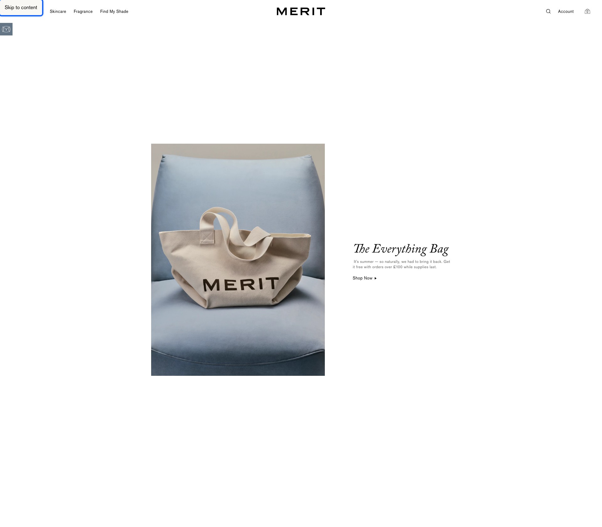
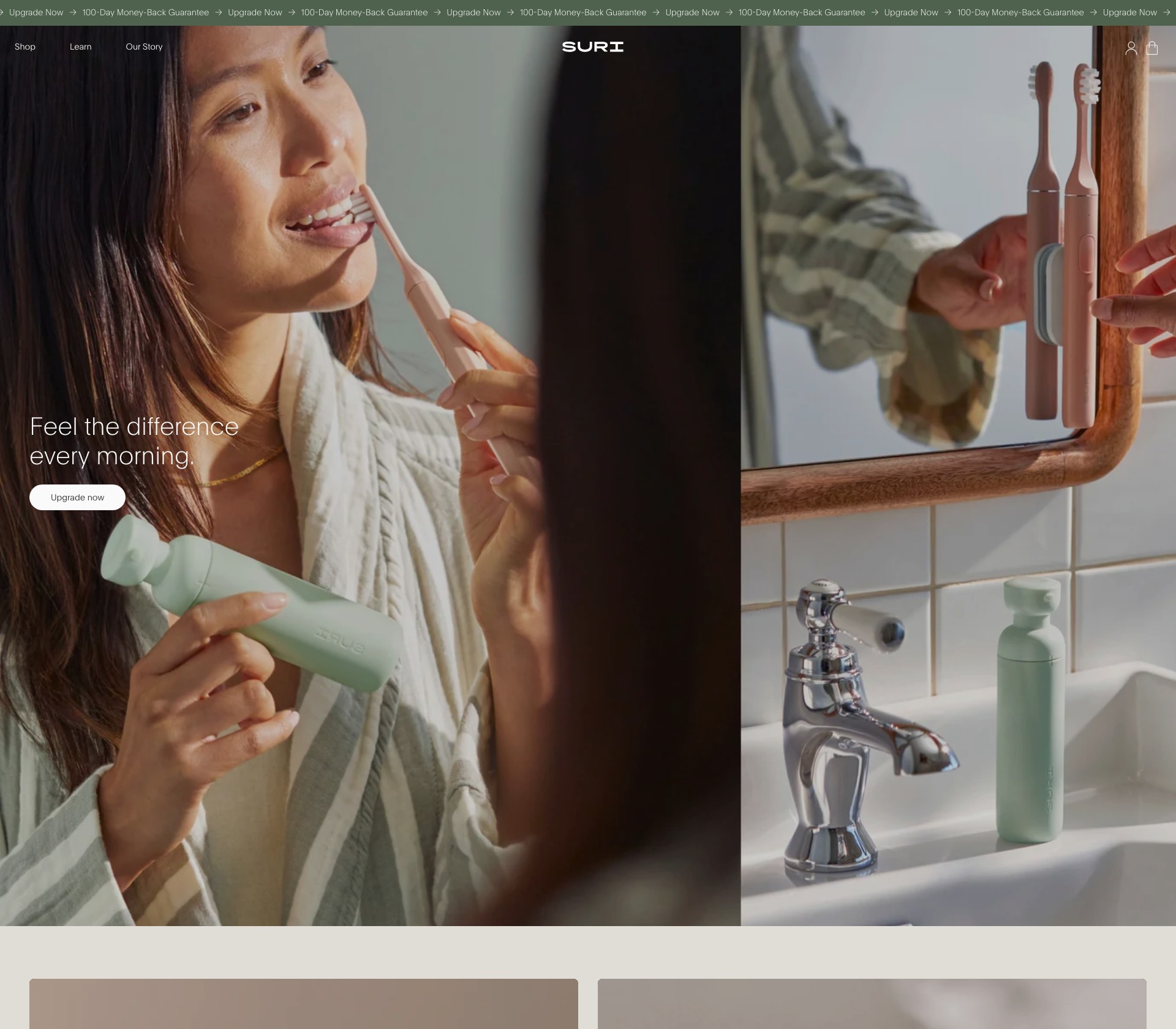
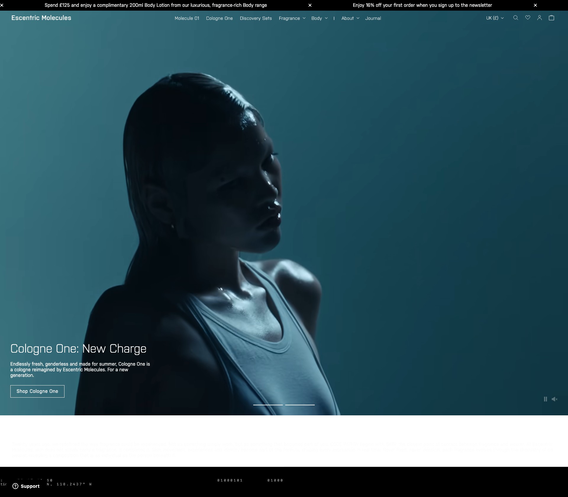
What minimalist storefronts here demonstrate
- Limited colour palettes with one or two accent tones
- Typography-led hierarchy replacing decorative UI elements
- Product photography as the primary visual anchor on most pages
- Simple navigation patterns with shallow menu depth
What you can learn from these examples
- When minimalism helps conversion versus when it hides key information
- Spacing and type scale choices that keep sparse layouts readable
- How to maintain brand personality with fewer visual elements